ShopDreamUp AI ArtDreamUp
Deviation Actions
Naked Fans
13 Subscribers
All the same benefits of Patreon but later. Everything will be released a few weeks after Patreon and all legacy content will be made available as soon as I can upload it.
$4/month


Suggested Deviants


Suggested Collections


You Might Like…


Featured in Groups


Description
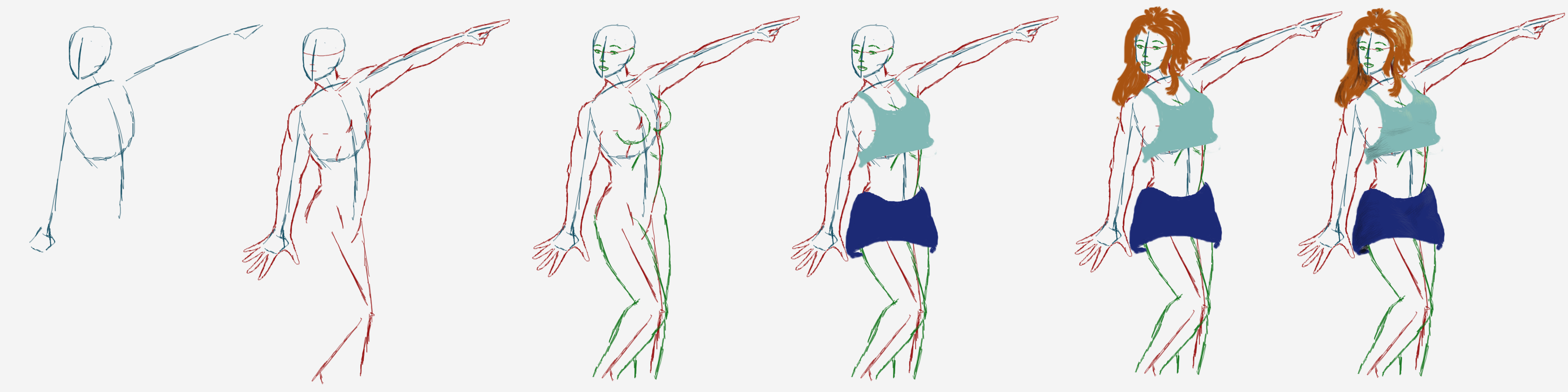
Just another quick sketch to show how I (usually) do my pics. You may notice that, unlike many artists, I don't do much of a "stick person" skeleton when constructing the figure. This is because I find it more realistic to follow the flow of muscles around those lines.
For more details of what follows, please see my previous walkthrough.
1 (Blue):
I start by drawing an oval for the character's rib-cage. Usually, I draw it at a tilt, since diagonal lines always seem more natural and dynamic than vertical or horizontal ones. A straight up (or sideways) rib-cage is great for a stoic or motionless character, but an angled one is better in just about all other cases.
Next, I draw a line down the middle of the torso. If you look in the mirror, you might notice that much of your body is a sort of "mirror image," split down the middle. This line acts as sort of a guide for the meeting of the pectoral muscles, abs and collar-bones (described below) and helps to visualize the shape of the body.
Following this, I draw stick-man lines for the arms, doing whatever it is that they're doing. Typically, one's arms are some of the most evocative parts of the body, and where we get much of our body language, so their position says a lot about action and mood. Note that, unless you're sticking your arms out like Frankenstein's monster or something, your limbs will typically attempt to balance one another's weight on the body, so sticking one arm way out will cause the other to rise a bit as well. These lines, and the shapes for the hands, offer a rough "destination" for the muscles that go from hand to elbow to shoulder.
Finally, I draw the head, reacting to whatever the arms are doing. This is the other big point of body-language. If you want to make a bold statement (such as a warrior striking with a weapon), draw the face looking at the same thing the hands are interacting with. For example, I could have drawn this figure looking to where the finger is pointing, in order to show that the destination is very important. For a more relaxed feeling (like here) show them looking toward something else - perhaps someone following behind. The variety between arm and hand activities shows that the subject isn't 100% focused, mentally, on what they're doing physically.
To depict the head, I stick to that typical oval you've seen in every other tutorial since da Vinci - so I won't bore you with repetition.
2 (Red):
Once I have the basic body language laid out, I draw a downward-pointing triangle of sorts, from the edge of the rib-cage to the genital area of the pelvis. This is the subject's abdominal muscles. I then go up to the draw the biceps of the raised arm, the deltoid where it attaches to the shoulder, and the extensors of the forearm, in that order. Going beneath, I draw the triceps (note that it doesn't make a "sausage" by connecting to the same area as the biceps, but anchors farther down, where the elbow would be) and the flexors (which do anchor at roughly the same place on the wrist as the extensors). Lastly, I detail the pointing hand.
Going back toward the torso, I draw the collar bone (this is where that central blue line starts to be handy), and the muscles of the neck and shoulder attaching to the arm. I then do the other side of the neck and the other arm. Here, I start with the deltoid and work my way down. When drawing muscles, it helps to not think of them one at a time, but as parts in a long system, weaving in and out of one another in logical progression. Again, the hand comes last, with fingers splayed to show excitement.
This done, I sketch the butt and hip opposite to the line I drew for the abs. In this case, I also corrected the rib by beefing it up just a little, and then drew the line down for the external oblique muscle.
Finally, I drew a guide-line for the forward (bent) leg, and another for the supporting leg, before going up and filling in the proportions for the face. Lastly, I sketched in a few details like the pectoral muscles and the other line of the abs, to help visualize the form.
3 (Green)
Here, I begin to fill in actual details, and we begin to recognize things like reasonably accurate age and gender. I start by doing the legs in a similar manner to the muscles of the arms, letting the muscles "flow" along their natural course. Since this character is female, I decided to make her a little more ample around the thighs than the upper body by using curves rather than angles. Additionally, women tend to have a little more "saddle bag" to their fatty tissues (we all have it, folks), whereas men tend to have more "gut."
Regarding the breasts, remember that breast tissue develops under the pectoral muscles as well as above them; those aren't just half-domes stuck to a lady's chest. Therefore, the curve of the breast should actually start just below the pectoral - how far below varying with boob-size. Additionally, remember that they're basically elastic bags filled with fat, so gravity will effect them, making the flesh underneath bulge, while pulling the flesh above tight. This results in a sort of "pear shape" - again, not domes or spheres - unless she's had some work done.
For the face, I start with a vary basic "emoji" sort of face. In this case, the eyes are a bit wide and round with interest, and the mouth is a sort of sideways "D," with a sight rise at the top. I then make some expressive eyebrows. For the nose, I draw a semi-horizontal line between the tip and the philtrum (that divot between your nose and mouth) and a line going up to the meeting of the eyebrows for the bridge. I then make a triangle radiating out from the meeting of those two lines for the nostrils, and finish with a sort of "C" shape for the ears. All of these facial features will be tinkered with later; for now, the lines are simply to show their place.
Features
With the figure done, it's time for clothing. For this, I create a new layer in GIMP; likewise with Photoshop, Sai or whatever app you use. Drawing realistic drapery on a figure is a whole other tutorial (or book, or series...). Weight and tightness of fabric, breeze, movement of the figure and so on can all affect the flow of clothes. For now, let it simply be known that I draw the clothes before hair, since collars, capes, pauldrons and hoods can affect the way the hair flows. Likewise, I draw clothing before colouring the skin, because there's no point in obsessing over details like freckles, shading and texture if a section of skin is hidden by cloth and accessories anyway.
Next, and on another layer, I do the hair. For this, I tend to use GIMP's "Soft Oil Brush" preset, shrunk down to whatever pixel size works for the smoothness/kinkiness of the character's 'do.
At this point, I would normally go back and make a third layer beneath the clothing layer for skin; but since this is just a quick tute, I didn't bother. (Wink)")
Lighting
Initially, I draw each layer as a single colour, without worrying about shadows, highlight and so on. These are known in animation as "flats;" and, in classical schooling, as "local colour." On most drawings, I would paint flats on the skin layer, clothing layer, hair layer, and possibly a few others, as needed. In this case, the clothing will demonstrate the idea.
With the flats done, I create another layer and choose the colour I want for the local lighting. Sunlight, for example, is sort of a creamy white-yellow light, and is what I used for the last image in this set. Consider the shape of your character and, when colouring, do your brush-strokes in the direction of any curves, angles, along locks of hair and so on. More details on how I do this can be found under the following two images:
Different Strokes 2
and
Light Lesson 1
It's also a good idea to tinker around with the various brushes at your disposal, and see what creative uses you can put them to. www.obsidiandawn.com/category/… has a variety of great texture brushes among their more niche "pattern-stamp" types. When using brushes, it's good to "think outside the box" with regard to their use. For example, I find that Obsidian Dawn's "Frost Brush" pack works just as well for dry leather, tree bark and monster skin as it goes for crackly ice. Using such a brush when laying down lighting makes the picture seem more real and tactile than a simple round brush.
A note about colouring shadows: If you look at a colour wheel ( christellemusungay.files.wordp… ), the colour of your shadows will be found directly opposite your lighting colour. So, since our sunlight in this example was yellow, our shadows will be a deep purple - as that is what is on the opposite side of the colour wheel. If your lighting were blue (say, for a winter scene or arctic pic), your shadows would be a dark red-oragne; green forest lighting would be create dark wine colour shadows; amber firelight would have blue shadows and so on. Never use complete black for your shadows unless things are truly dark (explorers in caves, boogie men in closets, etc.), as this will come off as feeling a bit unnatural. Instead, you want your hue to be just a bit off-black, and into the colours I just mentioned.
As with the lighting, follow the contours and planes of whatever you're colouring. The brush-strokes may not seem noticeable, but the eye will pick up on such little details, and will help define the shape of your subject.
Aaaaand that's basically the gist of it. I could write a whole other tutorial on realistic clothing, and another for skin, hair and textures, but I hope this helps as a general overview. Please feel free to leave comments and critiques.
For more details of what follows, please see my previous walkthrough.
1 (Blue):
I start by drawing an oval for the character's rib-cage. Usually, I draw it at a tilt, since diagonal lines always seem more natural and dynamic than vertical or horizontal ones. A straight up (or sideways) rib-cage is great for a stoic or motionless character, but an angled one is better in just about all other cases.
Next, I draw a line down the middle of the torso. If you look in the mirror, you might notice that much of your body is a sort of "mirror image," split down the middle. This line acts as sort of a guide for the meeting of the pectoral muscles, abs and collar-bones (described below) and helps to visualize the shape of the body.
Following this, I draw stick-man lines for the arms, doing whatever it is that they're doing. Typically, one's arms are some of the most evocative parts of the body, and where we get much of our body language, so their position says a lot about action and mood. Note that, unless you're sticking your arms out like Frankenstein's monster or something, your limbs will typically attempt to balance one another's weight on the body, so sticking one arm way out will cause the other to rise a bit as well. These lines, and the shapes for the hands, offer a rough "destination" for the muscles that go from hand to elbow to shoulder.
Finally, I draw the head, reacting to whatever the arms are doing. This is the other big point of body-language. If you want to make a bold statement (such as a warrior striking with a weapon), draw the face looking at the same thing the hands are interacting with. For example, I could have drawn this figure looking to where the finger is pointing, in order to show that the destination is very important. For a more relaxed feeling (like here) show them looking toward something else - perhaps someone following behind. The variety between arm and hand activities shows that the subject isn't 100% focused, mentally, on what they're doing physically.
To depict the head, I stick to that typical oval you've seen in every other tutorial since da Vinci - so I won't bore you with repetition.
2 (Red):
Once I have the basic body language laid out, I draw a downward-pointing triangle of sorts, from the edge of the rib-cage to the genital area of the pelvis. This is the subject's abdominal muscles. I then go up to the draw the biceps of the raised arm, the deltoid where it attaches to the shoulder, and the extensors of the forearm, in that order. Going beneath, I draw the triceps (note that it doesn't make a "sausage" by connecting to the same area as the biceps, but anchors farther down, where the elbow would be) and the flexors (which do anchor at roughly the same place on the wrist as the extensors). Lastly, I detail the pointing hand.
Going back toward the torso, I draw the collar bone (this is where that central blue line starts to be handy), and the muscles of the neck and shoulder attaching to the arm. I then do the other side of the neck and the other arm. Here, I start with the deltoid and work my way down. When drawing muscles, it helps to not think of them one at a time, but as parts in a long system, weaving in and out of one another in logical progression. Again, the hand comes last, with fingers splayed to show excitement.
This done, I sketch the butt and hip opposite to the line I drew for the abs. In this case, I also corrected the rib by beefing it up just a little, and then drew the line down for the external oblique muscle.
Finally, I drew a guide-line for the forward (bent) leg, and another for the supporting leg, before going up and filling in the proportions for the face. Lastly, I sketched in a few details like the pectoral muscles and the other line of the abs, to help visualize the form.
3 (Green)
Here, I begin to fill in actual details, and we begin to recognize things like reasonably accurate age and gender. I start by doing the legs in a similar manner to the muscles of the arms, letting the muscles "flow" along their natural course. Since this character is female, I decided to make her a little more ample around the thighs than the upper body by using curves rather than angles. Additionally, women tend to have a little more "saddle bag" to their fatty tissues (we all have it, folks), whereas men tend to have more "gut."
Regarding the breasts, remember that breast tissue develops under the pectoral muscles as well as above them; those aren't just half-domes stuck to a lady's chest. Therefore, the curve of the breast should actually start just below the pectoral - how far below varying with boob-size. Additionally, remember that they're basically elastic bags filled with fat, so gravity will effect them, making the flesh underneath bulge, while pulling the flesh above tight. This results in a sort of "pear shape" - again, not domes or spheres - unless she's had some work done.
For the face, I start with a vary basic "emoji" sort of face. In this case, the eyes are a bit wide and round with interest, and the mouth is a sort of sideways "D," with a sight rise at the top. I then make some expressive eyebrows. For the nose, I draw a semi-horizontal line between the tip and the philtrum (that divot between your nose and mouth) and a line going up to the meeting of the eyebrows for the bridge. I then make a triangle radiating out from the meeting of those two lines for the nostrils, and finish with a sort of "C" shape for the ears. All of these facial features will be tinkered with later; for now, the lines are simply to show their place.
Features
With the figure done, it's time for clothing. For this, I create a new layer in GIMP; likewise with Photoshop, Sai or whatever app you use. Drawing realistic drapery on a figure is a whole other tutorial (or book, or series...). Weight and tightness of fabric, breeze, movement of the figure and so on can all affect the flow of clothes. For now, let it simply be known that I draw the clothes before hair, since collars, capes, pauldrons and hoods can affect the way the hair flows. Likewise, I draw clothing before colouring the skin, because there's no point in obsessing over details like freckles, shading and texture if a section of skin is hidden by cloth and accessories anyway.
Next, and on another layer, I do the hair. For this, I tend to use GIMP's "Soft Oil Brush" preset, shrunk down to whatever pixel size works for the smoothness/kinkiness of the character's 'do.
At this point, I would normally go back and make a third layer beneath the clothing layer for skin; but since this is just a quick tute, I didn't bother.
Lighting
Initially, I draw each layer as a single colour, without worrying about shadows, highlight and so on. These are known in animation as "flats;" and, in classical schooling, as "local colour." On most drawings, I would paint flats on the skin layer, clothing layer, hair layer, and possibly a few others, as needed. In this case, the clothing will demonstrate the idea.
With the flats done, I create another layer and choose the colour I want for the local lighting. Sunlight, for example, is sort of a creamy white-yellow light, and is what I used for the last image in this set. Consider the shape of your character and, when colouring, do your brush-strokes in the direction of any curves, angles, along locks of hair and so on. More details on how I do this can be found under the following two images:
Different Strokes 2
and
Light Lesson 1
It's also a good idea to tinker around with the various brushes at your disposal, and see what creative uses you can put them to. www.obsidiandawn.com/category/… has a variety of great texture brushes among their more niche "pattern-stamp" types. When using brushes, it's good to "think outside the box" with regard to their use. For example, I find that Obsidian Dawn's "Frost Brush" pack works just as well for dry leather, tree bark and monster skin as it goes for crackly ice. Using such a brush when laying down lighting makes the picture seem more real and tactile than a simple round brush.
A note about colouring shadows: If you look at a colour wheel ( christellemusungay.files.wordp… ), the colour of your shadows will be found directly opposite your lighting colour. So, since our sunlight in this example was yellow, our shadows will be a deep purple - as that is what is on the opposite side of the colour wheel. If your lighting were blue (say, for a winter scene or arctic pic), your shadows would be a dark red-oragne; green forest lighting would be create dark wine colour shadows; amber firelight would have blue shadows and so on. Never use complete black for your shadows unless things are truly dark (explorers in caves, boogie men in closets, etc.), as this will come off as feeling a bit unnatural. Instead, you want your hue to be just a bit off-black, and into the colours I just mentioned.
As with the lighting, follow the contours and planes of whatever you're colouring. The brush-strokes may not seem noticeable, but the eye will pick up on such little details, and will help define the shape of your subject.
Aaaaand that's basically the gist of it. I could write a whole other tutorial on realistic clothing, and another for skin, hair and textures, but I hope this helps as a general overview. Please feel free to leave comments and critiques.
Image size
4000x1000px 1.05 MB
© 2016 - 2024 Djake
Comments0
Join the community to add your comment. Already a deviant? Log In